
Today is the day that Google (finally) imposes on all websites to cater to the web’s most used devices: Mobiles. With the majority of web searches now originating by mobile devices, Google now punishes all websites that are not built responsive (= format adapting to all screen sizes). Practically this means that if your website is not mobile-friendly adapted using responsive design, you’ll drop significantly down the ranks.
But surely your site is responsive…or is it?
Google provides some help in finding out at least. Yet it’s up to you to act and have it made responsive asap. Although the due date is today, April 21st, you will want to recover sooner than later of the damage caused by it. Read here more details >>. Or go directly to the Mobile-Friendly Test.
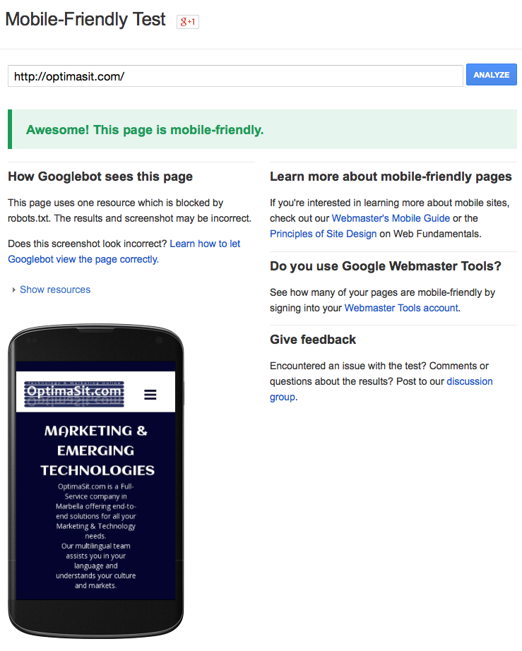
The result should look like this to not be punished:
Your web developer should by definition build new websites to be fully responsive, on any device and in any browser. This is however not so obvious still today. Yet do not accept anything less! What are all the online marketing efforts for when a non-responsive site gets hammered down the ranks? Take action NOW if you are still in the pre-April 21st age!
OptimaSit.com was the first company in the south of Spain to introduce mobile websites and educate the business community back in 2011. 4 years have passed and what we predicted back then, based on what was said amongst industry experts, is that D-Day would come sooner or later. It was a bit later than anticipated yet it’s here now.
For more information on mobilising your website or any other question you may have on web technologies and SEO / online marketing, please contact us at solutions @ optimasit.com or at +34 952 770 306.